Data visualization: How far are we from a low-carbon power system?

80,000 years ago, Homo sapiens learned to drill wood for the fire. Since then, the availability of energy has transformed humanity. In recent decades, human has unlocked diverse technologies for nuclear, hydroelectric, and other renewable energy sources, but until now, fossil fuels have dominated the global energy production mix.
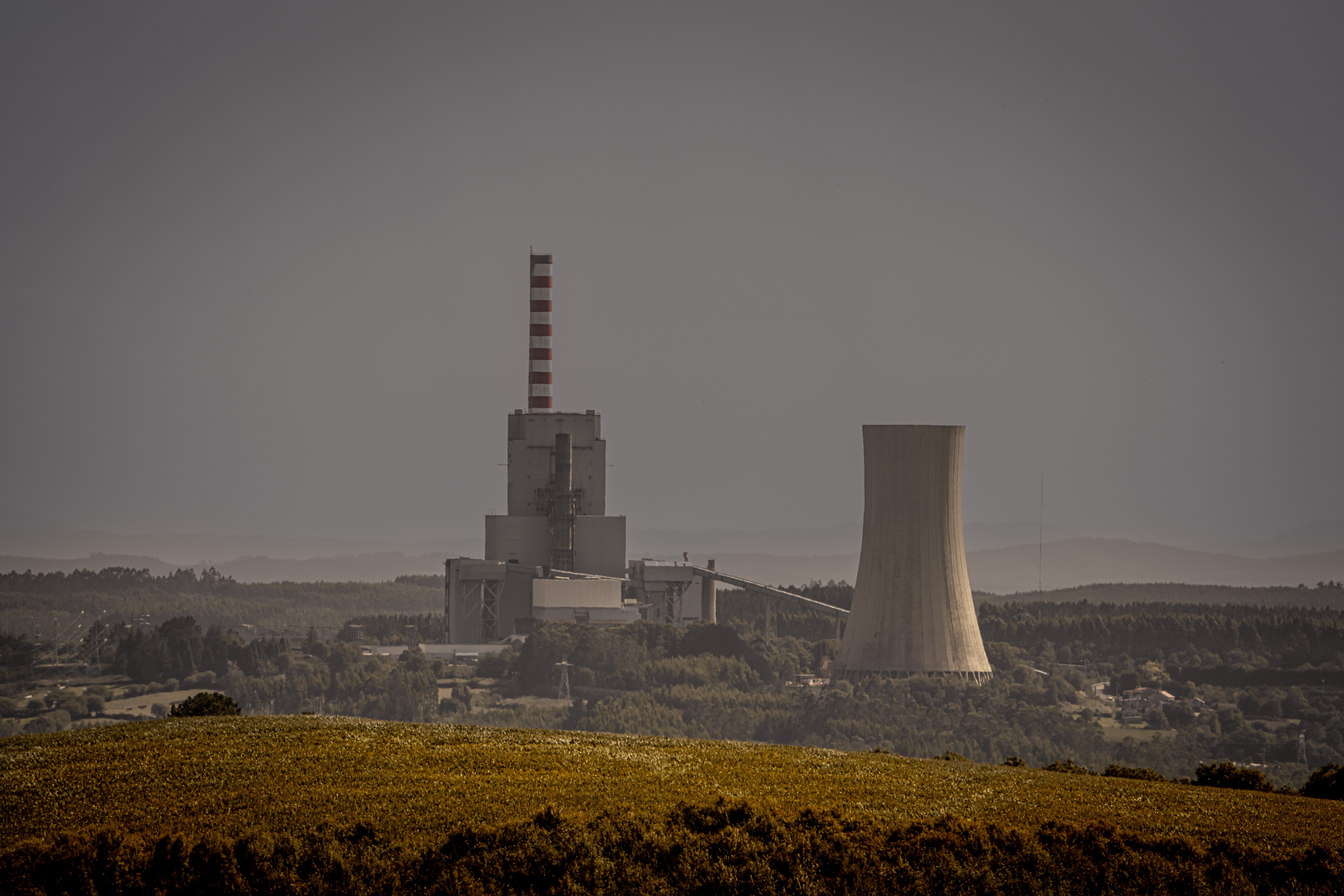
Fossil fuels are the sum of coal, oil, and natural gas. They are the largest source of global carbon dioxide (CO 2 ) emissions. Energy production – mainly the burning of combustible fuels – accounts for around three-quarters of global greenhouse gas emissions. To combat climate change, we need to reduce the share of generation of combustible fuels and shift the energy system to low-carbon energy sources, which are the sum of nuclear energy and renewables, including hydropower, wind, solar, bioenergy, geothermal and wave and tidal.
However, statistically, our progress since 1990 has been far less satisfactory. Despite producing more and more energy from renewables each year, we continue to burn more combustible fuels. The following interactive charts show the energy production mix from 1990 to 2019. We will explore how energy production varies across the world, how it changes over time, and whether we are making progress in shifting towards a low-carbon energy system.
Energy Production over Years

| Data source: The World Bank.
These two interactive charts show the correlation between GDP per capita and energy production per capita, as well as the share and annual change of different categories of energy production. With the filters on the right, you can switch to see the data for each country.
In 1992, the United Nations Framework Convention on Climate Change (UNFCCC), adopted by countries in Brazil, stated that since the increase in atmospheric greenhouse gas concentrations was largely the result of earlier emissions from developed countries, developing and developed countries had "common but differentiated responsibilities". In the following years, an ongoing debate in negotiations centered on whether and how developed countries should provide climate funding to developing countries.
The reason for showing the curves for GDP per capita and energy production per capita is that poorer countries face a bigger challenge: they must grow their economies, whilst avoiding the carbon-intensive pathways today’s rich countries have taken. However, people in poor countries don't even have adequate access to energy.
As shown in the Energy Production over Years chart, combustible fuels remain to be the major means to generate energy globally, and the amount is increasing every year.
Switching to look at the data for each country, Iceland had the highest percentage of low-carbon energy production in 2019. Most of the energy came from hydropower and nuclear generation. Sweden, Norway, France, and Switzerland all got a large amount from nuclear or renewables.
At the other end of the scale, some countries rely almost entirely on fossil fuels, such as the oil-producing countries - Saudi Arabia, Oman, and Kuwait.
Among the largest emerging economies, South Africa, India, and China rely heavily on combustible fuels, while Brazil, achieves a higher share of hydro production.
Energy Production by Countries

| Data source: The World Bank.
The chart shows the ranking of countries by sectors of energy production.
UN report shows that the top seven emitters (China, the United States of America, India, the European Union, Indonesia, the Russian Federation, and Brazil) accounted for about half of global greenhouse gas emissions. The following chart reveals that China and the United States are far ahead of other countries in terms of the consumption of combustible energy. India, Japan, and Russia are also significantly ahead on a numerical scale.
Rankings for other sectors are available by using filters, and the animation displays the yearly changes in the ranks.
Energy Production by Sectors

| Data source: The World Bank.
When looking at total energy production, differences across countries often reflect differences in population size: countries with lots of people inevitably consume and produce more energy than tiny countries.
This interactive map shows the amount of energy produced per capita by country by the shade of color. There are vast differences across the world. The largest energy producers include Iceland, Canada, the United States, and Sweden. The production per capita in these countries is as much as 100 times more than that in some of the poorest countries in Africa.
View the number of sectors produced per capita through the filter on the right, with an animation showing the year-to-year change in production.
Going back to the million-dollar question, are we on track to shift to a low-carbon energy system as well as reach net zero by 2050?
No, and we are very far from the goal.
This answer is based not only on realistic data, but even the commitments made by governments to date fall far short of the requirement. Current national climate plans – for 193 Parties to the Paris Agreement taken together – would lead to a sizable increase of almost 11% in global greenhouse gas emissions by 2030, compared to 2010 levels. Getting to net zero requires all governments – first and foremost the biggest emitters – to significantly strengthen their Nationally Determined Contributions (NDCs) and take bold, immediate steps towards reducing emissions now. The Glasgow Climate Pact called on all countries to revisit and strengthen the 2030 targets in their NDCs by the end of 2022, but only 24 new or updated climate plans were submitted by September 2022.